ThisWay - Airport Navigation App
ThisWay is an app designed to help visually impaired users navigate airports using text-to-speech cues, visual indicators, and translation features. It addresses challenges like difficulty reading signage from a distance or understanding unfamiliar languages.
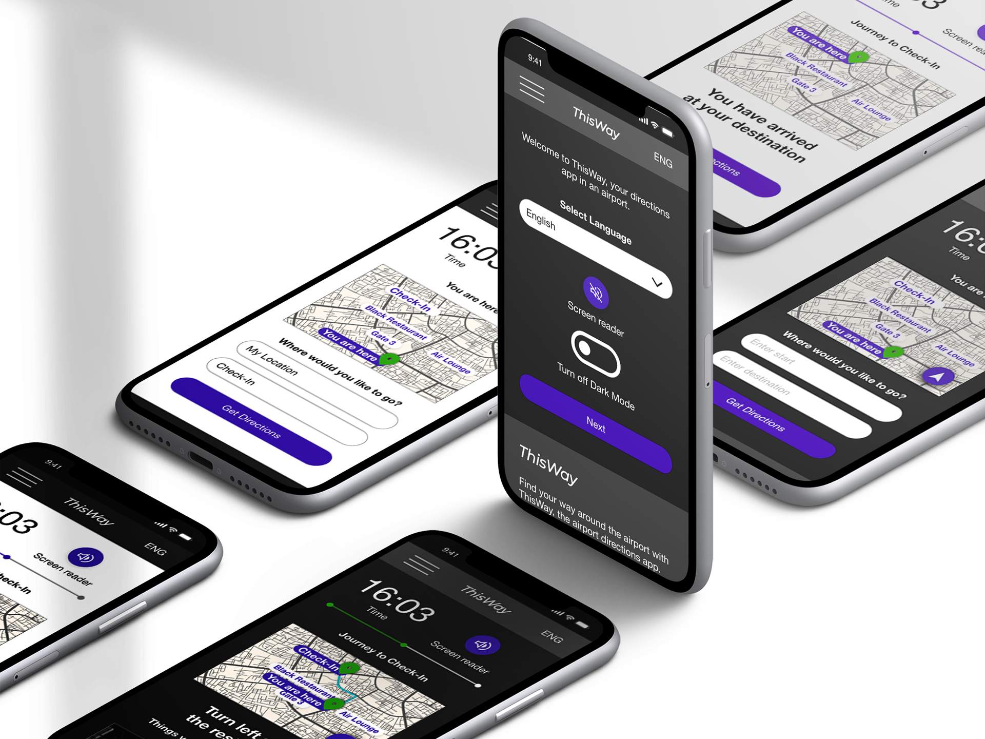
High-fidelity mockups of the ThisWay app
Project Duration
3 months
My Role
UX designer designing an app for ThisWay from conception to delivery.
Responsibilities
- Conducting interviews
- Paper and digital wireframing
- Low and high-fidelity prototyping
- Conducting usability studies
- Accounting for accessibility
- Iterating on designs.
User Research
I conducted interviews and developed empathy maps to understand the users I was designing for and their requirements. The main user groups identified through research included individuals with visual impairments and multilingual individuals.
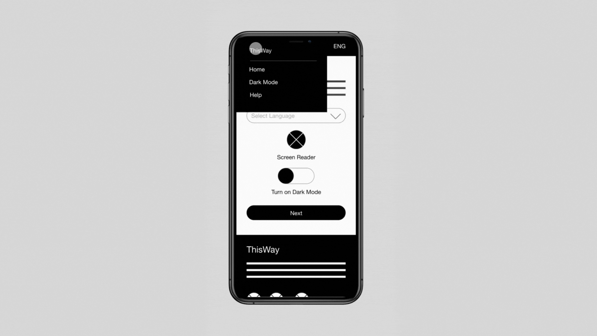
The app validated assumptions about ThisWay’s users, but further research uncovered a desire for a dark mode feature.
Ideation
The 8 sketches represent some features I thought would be useful for the application.
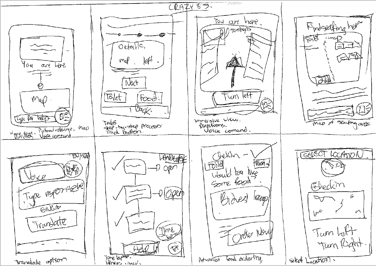
Ideation phase showing 8 possible options I could explore
Digital Wireframes and Low-Fidelity Prototype
My primary goal was to integrate functionalities that assist users with visual impairments. I opted for a minimalist design approach, ensuring ample usage of negative space and prominently sized buttons.
Low-fidelity prototype
Usability Study Findings
1. Users prefer receiving directions audibly from the application rather than relying on visual cues from their devices.
2. Users want to know where they are in the airport relative to where they want to be.
2. Users want to know where they are in the airport relative to where they want to be.
3. Users want to be able to toggle between light and dark modes to suit their vision.
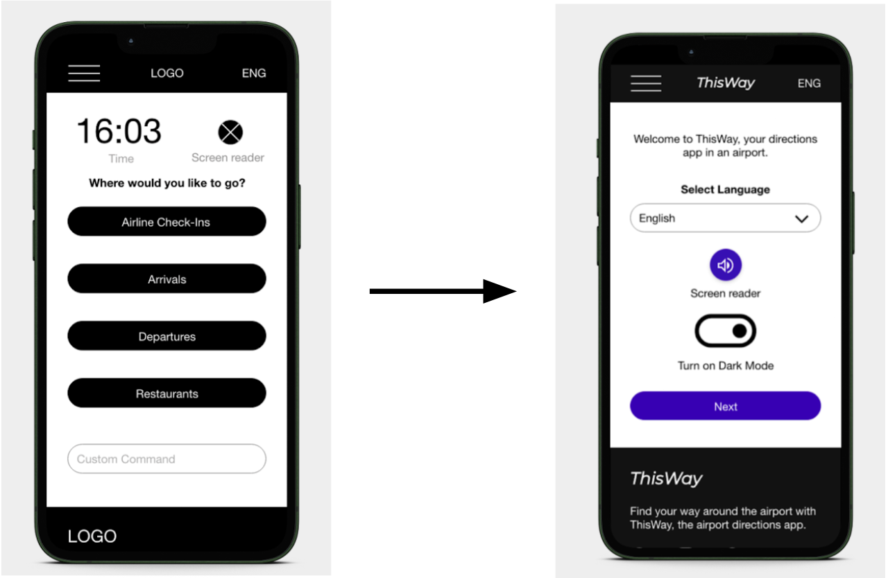
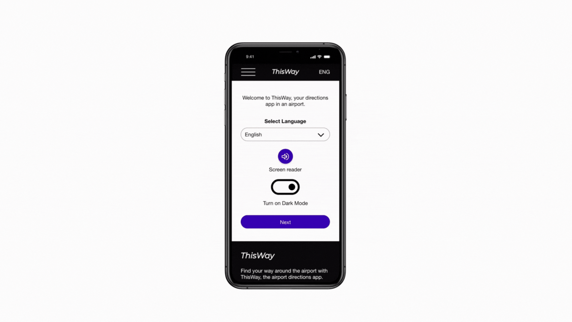
The mockups depict the welcome screen. Prior to the usability study, users could initiate a destination search immediately. However, I had to consider that first-time users might want to set up some default settings upon their initial use of the application.
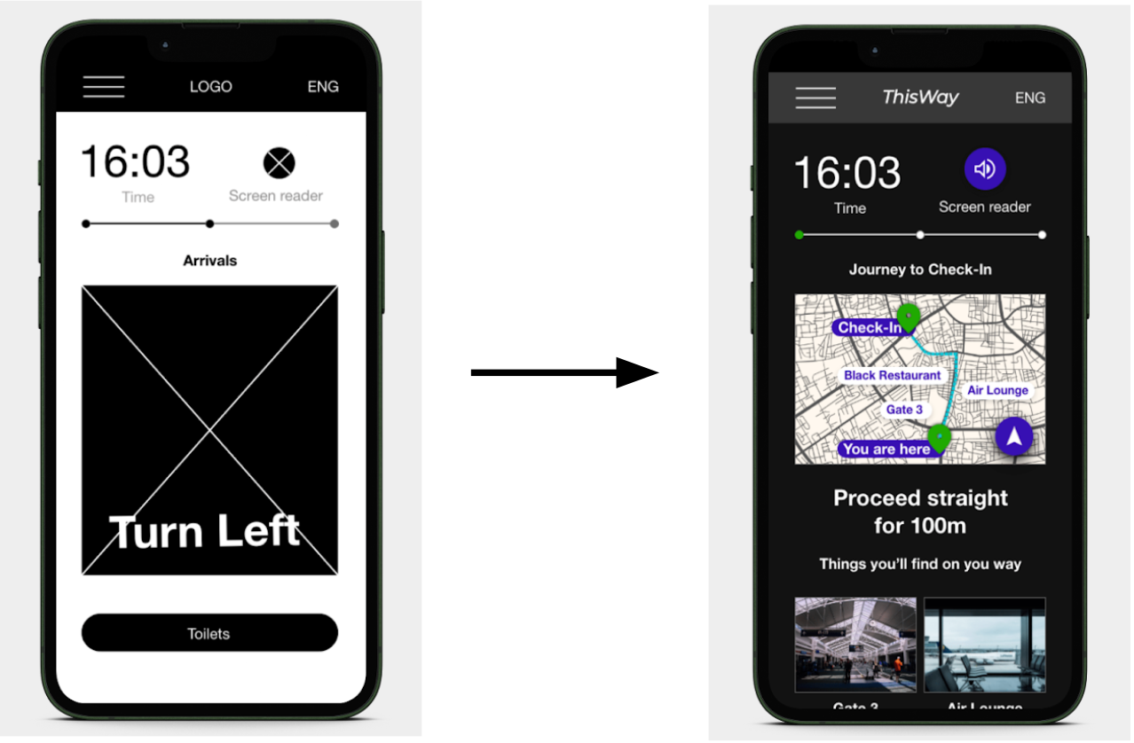
Initially, direction prompts were intended to appear directly on the map. However, following the usability study, users expressed a preference for cues to be displayed in a separate location, making it easier for them to see.
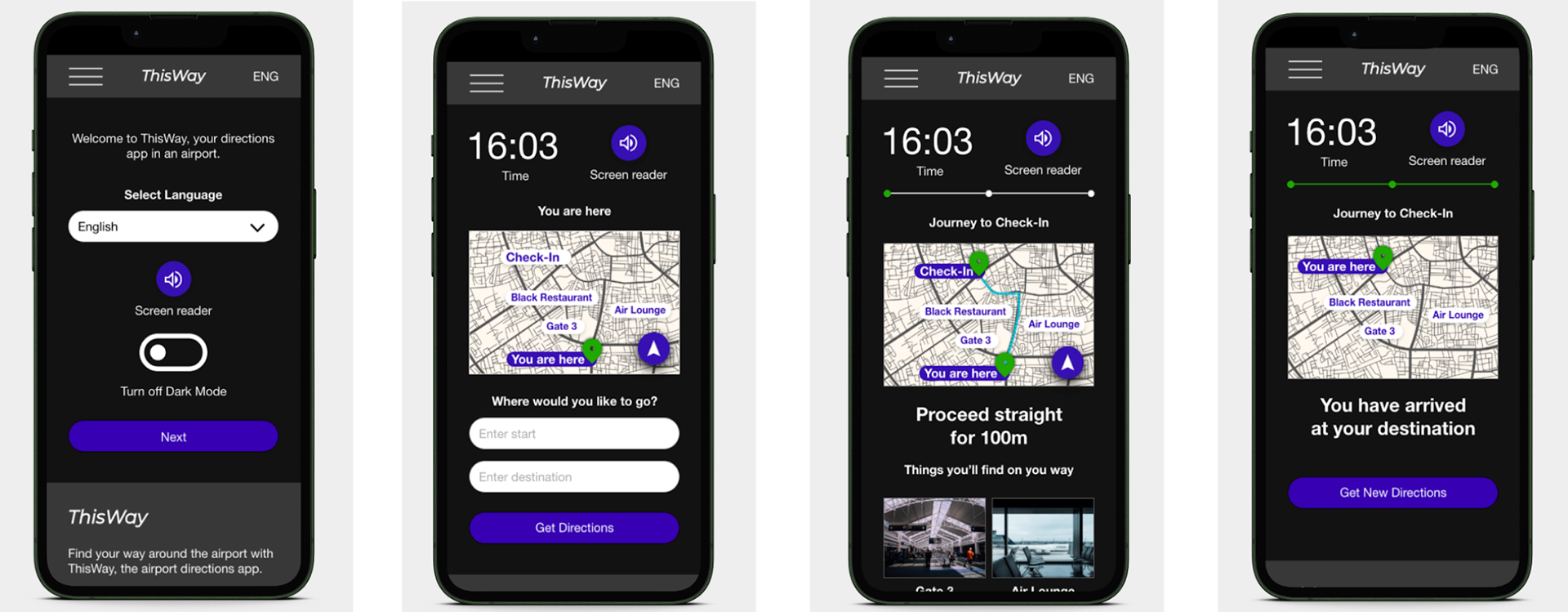
Dark mode high-fidelity mockups
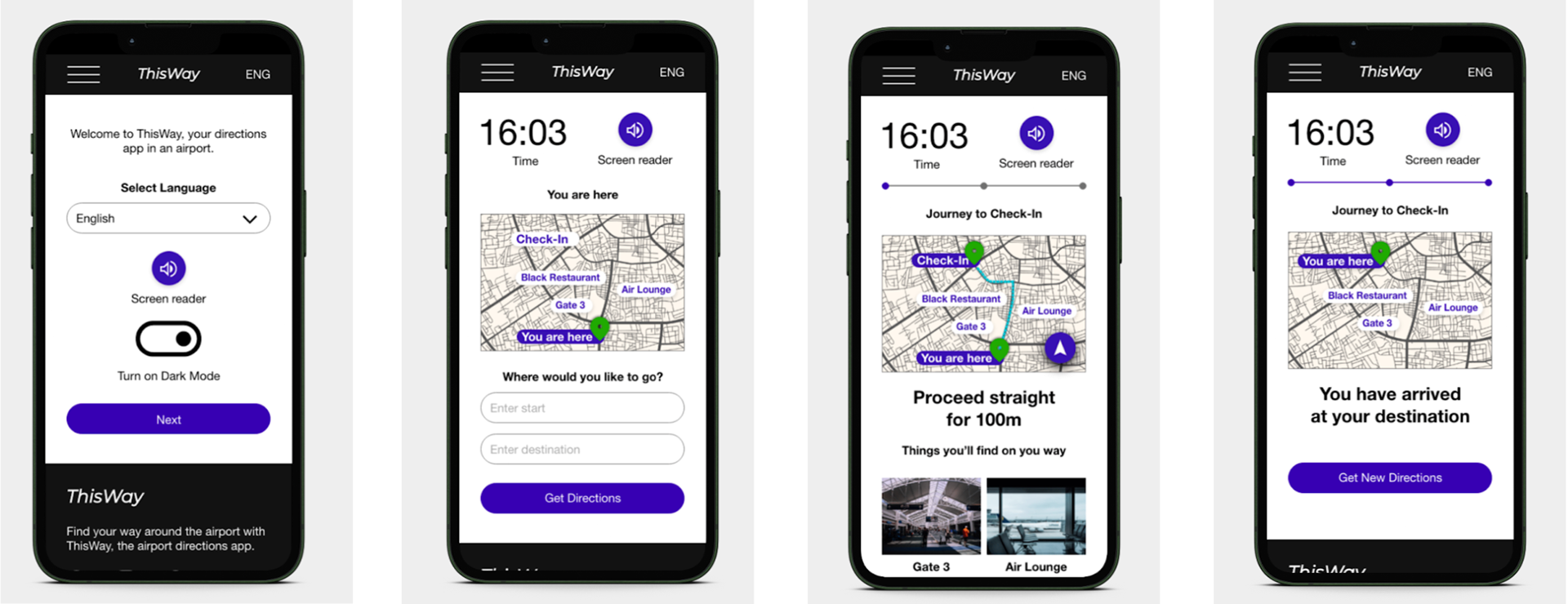
Light mode high-fidelity mockups
High-fidelity prototype
Accessibility Considerations
1. Implemented dark mode to reduce eye strain during prolonged use.
2. Applied high-contrast colour schemes to improve legibility, in line with WCAG guidelines.
Responsive Designs
In my responsive designs, I adopted a one-page layout for larger screens, streamlining the user experience by removing the need for scrolling and allowing users to concentrate solely on the map.
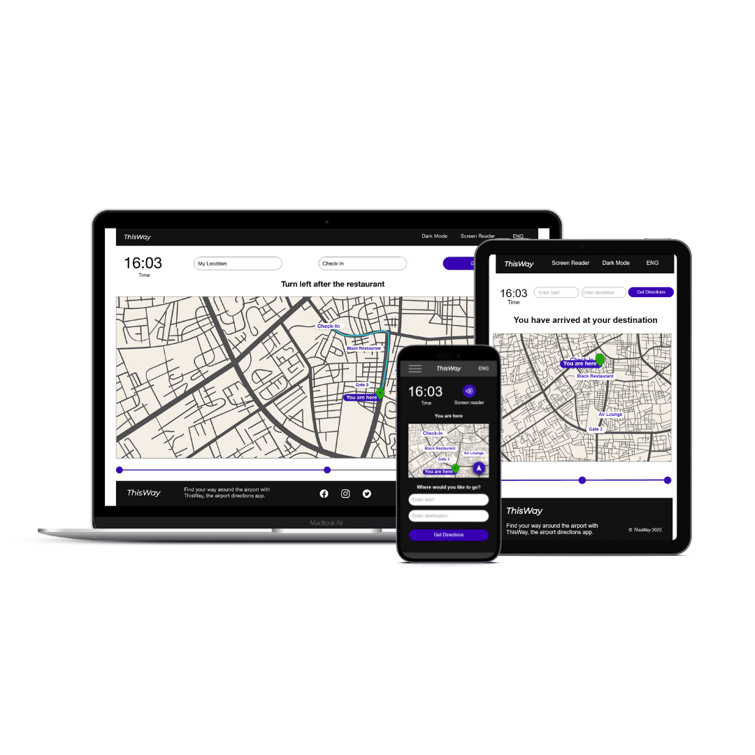
Responsive designs
What I Learnt
Investing time in understanding user needs is a journey that opens up new design opportunities. What we assume to be suitable for a particular user group may not always align with their actual needs. This learning process significantly shaped the final design outcome.
Impact
The app offers users a sense of reliability in moments of uncertainty, providing them with an alternative to traditional signage and catering to multilingual individuals or those who communicate in different languages.
Impact
The app offers users a sense of reliability in moments of uncertainty, providing them with an alternative to traditional signage and catering to multilingual individuals or those who communicate in different languages.
“The app gives a convenient sense of ease to navigate big airports and possibly reducing flight delays often caused by lost passengers.” - Quote from user feedback.
Thank you for your time reviewing my work on ThisWay.